
The Problem
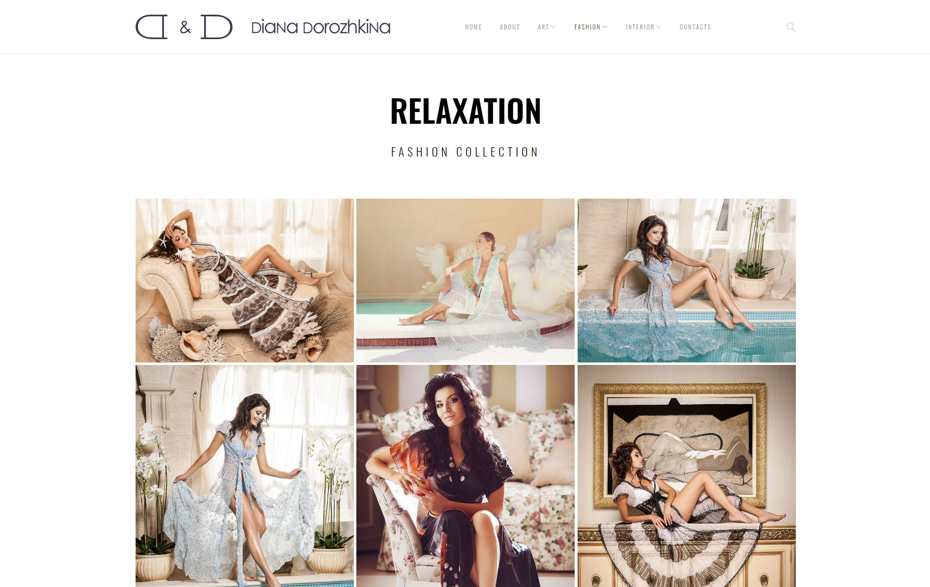
This project needed a digital portfolio for a contemporary visual artist that recreated the pristine, focused environment of a physical gallery. The genuine constraint: any visible interface design competes for attention with the brushwork it's meant to showcase, so the design's job was to disappear.

My Role
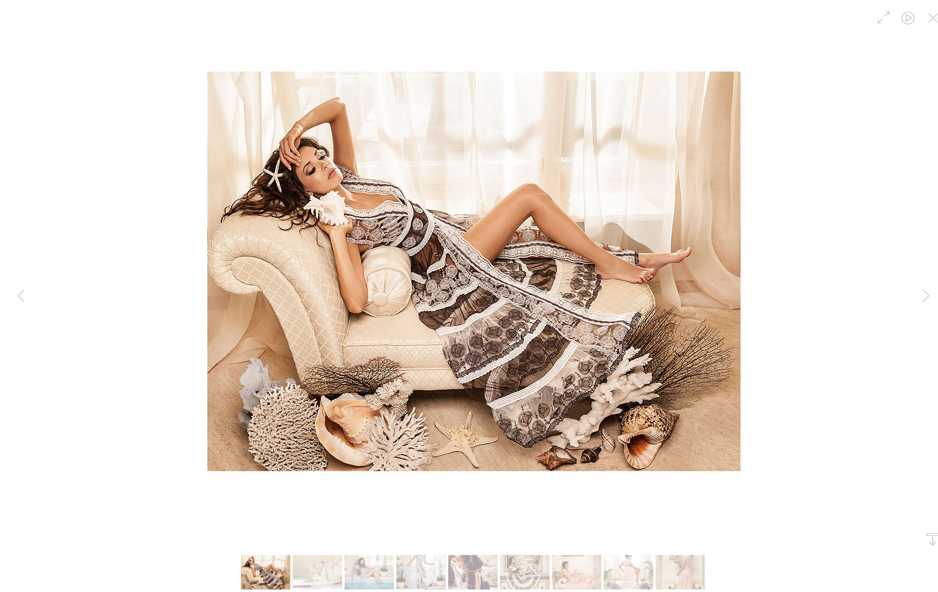
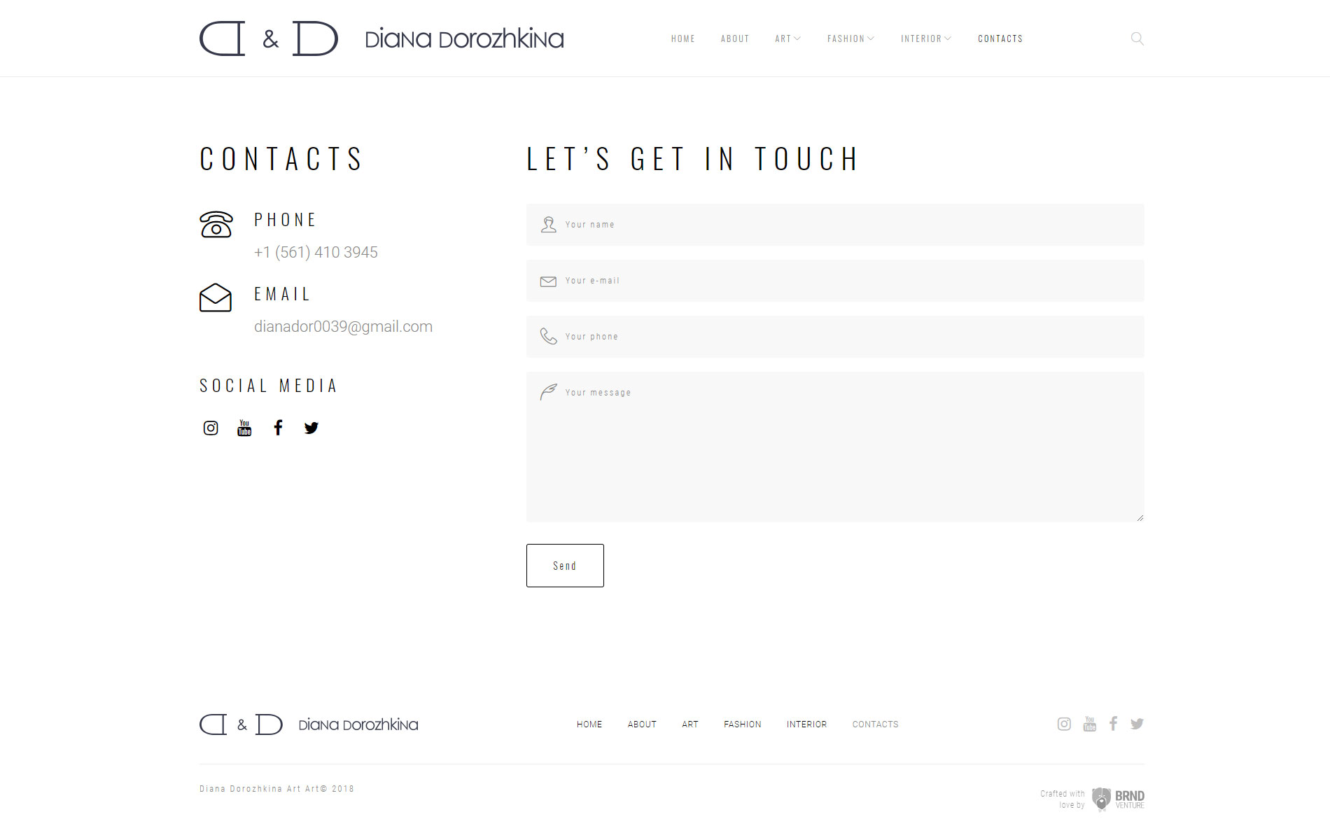
I built a rigorously minimal, photography-first system — extreme white space, a deliberately understated typographic hierarchy, navigation stripped to its essential function. Every decision erred toward less: fewer UI elements, fewer competing visual signals, more room for the work itself.

The Result
The finished platform reads as a gallery-quality digital exhibition space, elevating the perceived value of the artwork through what it deliberately leaves out — creating the distraction-free environment high-end art inquiries actually depend on.